Project Details: Laundromat website/app – Student Project, Emily Carr University
Responsible for: UI/Visual Design
Tools: Photoshop, Illustrator
Techniques: Mockup
ABOUT THE PROJECT
Laudromat is a website and mobile interface design project for the Interaction Design Studio class. It is a laundry pick-up and delivery service run by a start-up company. The service targets young city professionals and the selling point is the service’s environmental-friendly method of washing. The instructor gave a brief as a client and ask for following deliverables,
⚑ 3 versions of logos
⚑ 3 versions of website/app layout
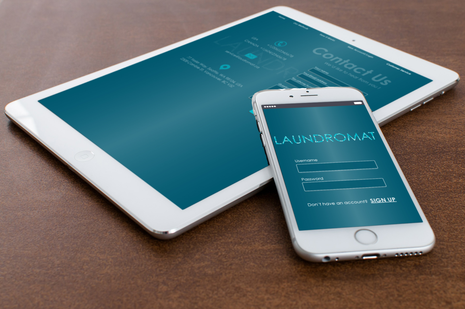
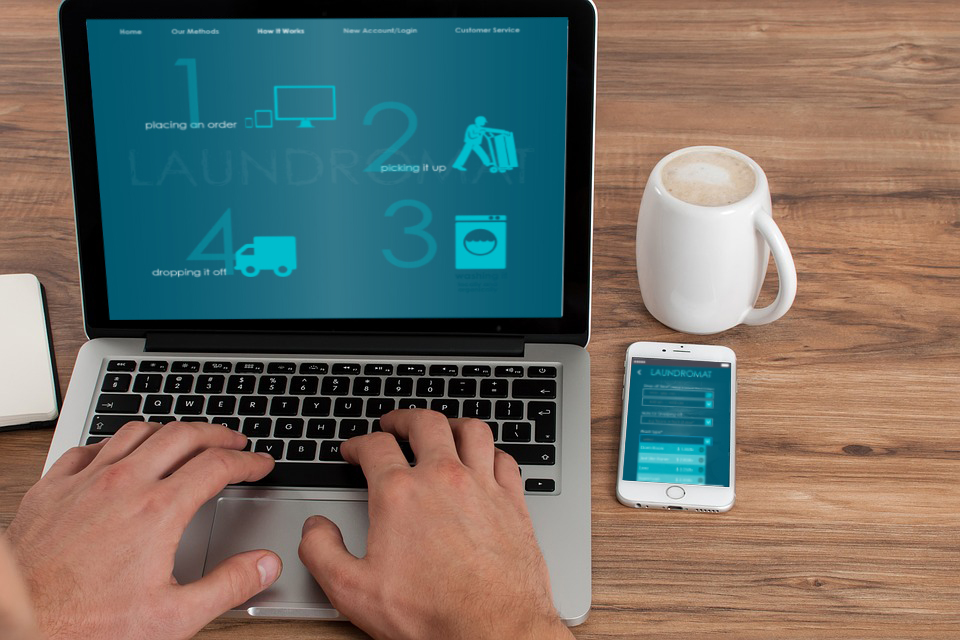
⚑ A full constructed website and app mockups
LOGO DESIGN

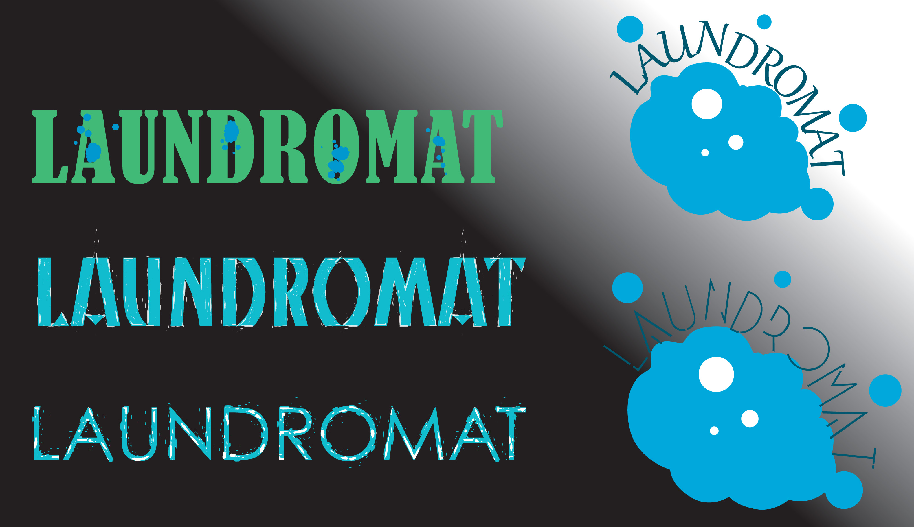
Based on the idea of “washing”, I made the logos with different water splashes and bubbles. The bright green and blue gave people a fresh and environmental-friendly feel. The instructor picked the one at the bottom left and suggested that I further work on the splashes to make the ones outside of the letters blue to avoid background color issues.
LAYOUT DESIGN
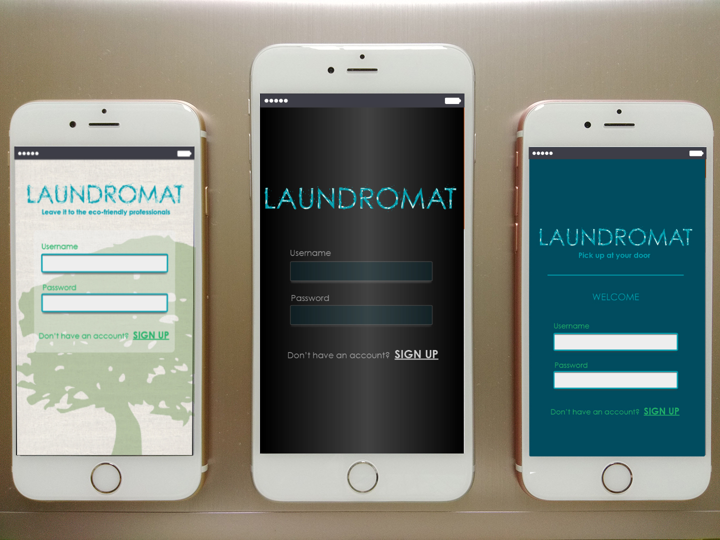
The layout design at the left used the nature concept to build up a fresh and easy-breezy look. With the paper-texture background the design appears more eco-friendly.
The movie-poster- like layout at the middle aims to have an impactful and high-quality feel which appeals to young professionals.
The layout design on the right follows the basic washing concept, which is the blue colour scheme.
The instructor picked a mix of the middle and right ones, ultimately deciding on the concept of the middle one with the colour scheme of the right one.


Recent Comments